Swivel: Developing a New Remote Office Experience
I found myself wanting a lightweight tool that would facilitate office conversation with a low barrier to entry. My initial thought was that taking the time to call someone via Zoom or Hangouts was just too formal. Placing a call takes more effort than just speaking, and gives your coworker a chance to decline. There’s no overhearing office chatter with calls that are so planned and boring. “Wouldn’t it be great if I could just hold a keyboard shortcut and talk through my coworker’s office speakers?” I thought.

If we could maintain video calls for long periods of time to pair-program, why couldn’t we just always have a connection to the whole team open, awaiting a quick key-press to engage? Shoot—why couldn’t we even emulate an open floor plan where the default is to overhear what’s going on? I worked from coffee shops; coworking spaces; open offices. I gleaned thoughts about what it means to be present in a space:
- Presence is passive
- Presence always implies proximity (which affects volume)
- Presence is observable by all parties
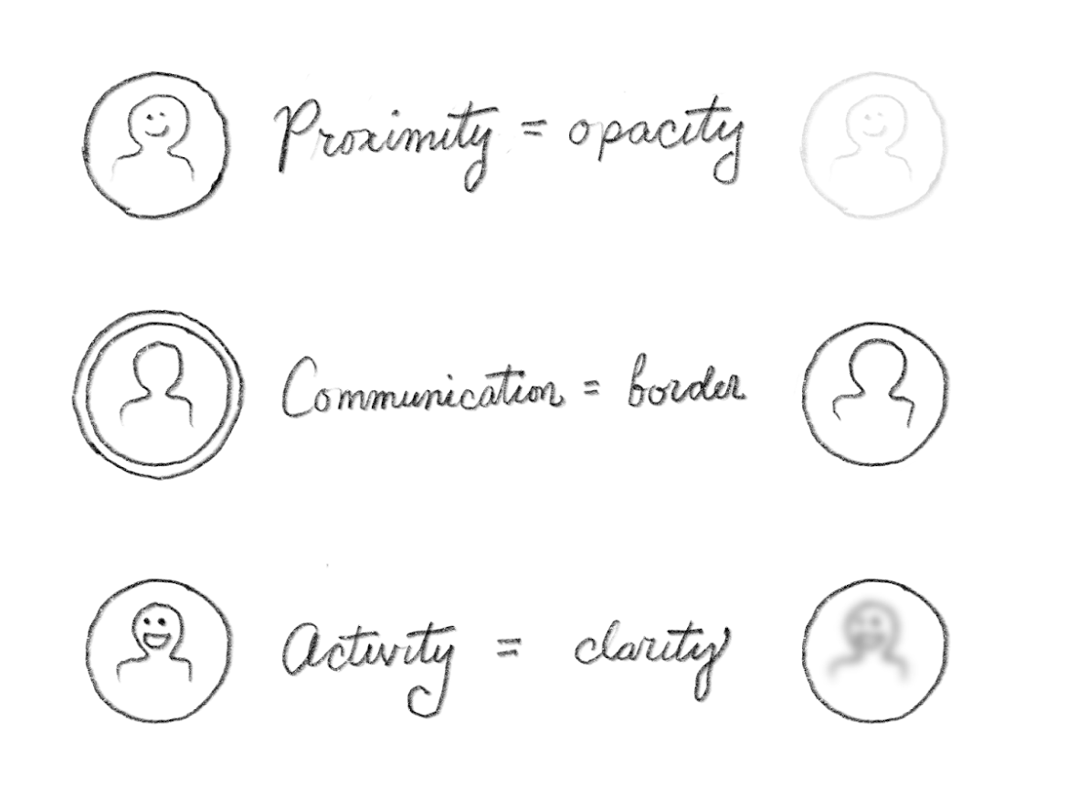
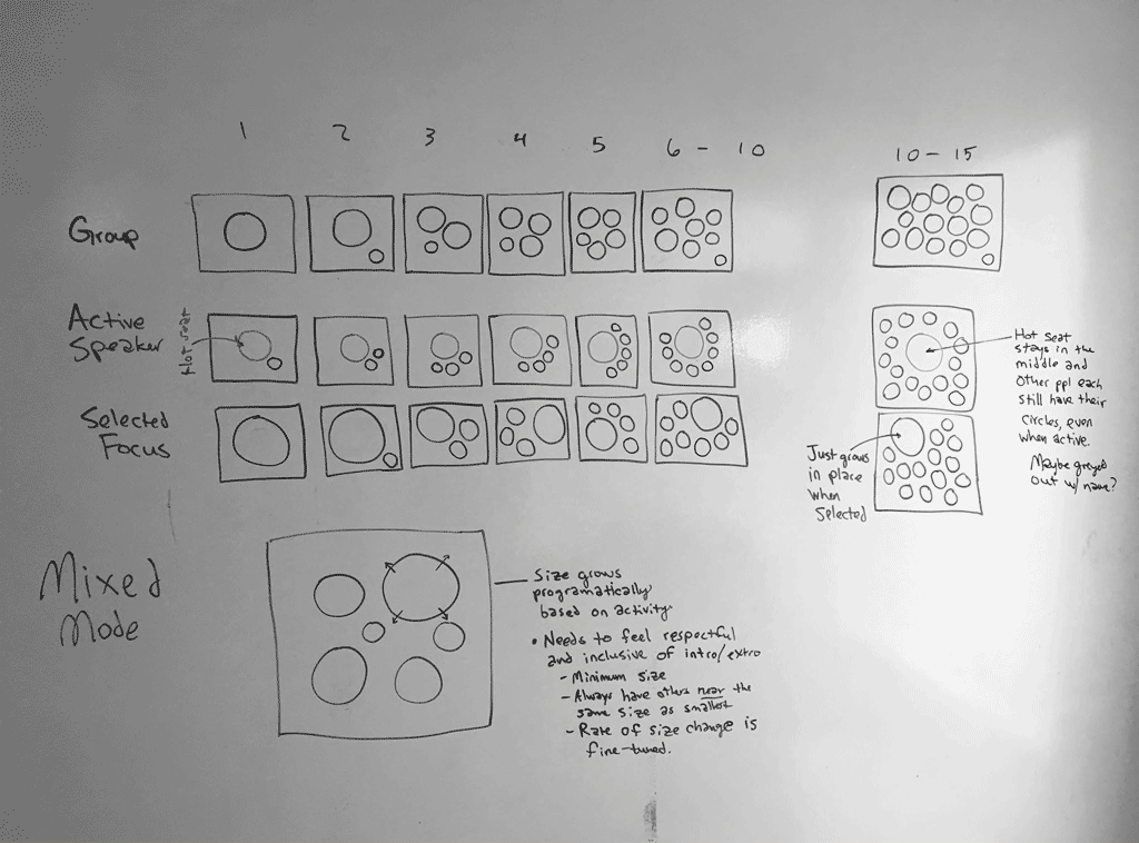
From these thoughts, I began sketching ideas for how presence, proximity, and volume might be represented naturally to users.
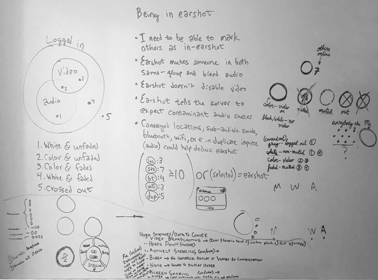
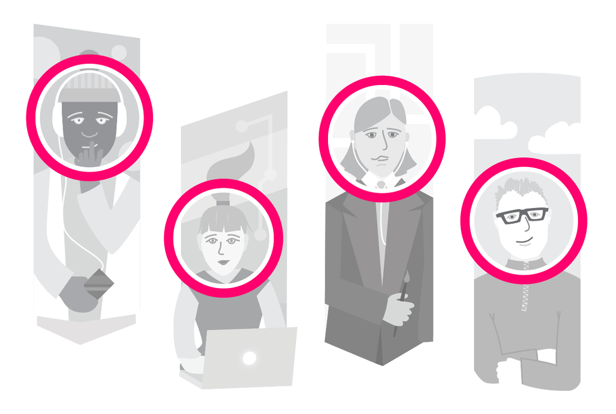
There were lots of things to think about in the realm of presence. Was it OK for someone to hear me if I couldn’t hear them? What about seeing someone’s video when they were talking to a group I wasn’t in? Should we use people’s locations to deduce their actual physical presence in a room? The list went on. In order to start small and fail fast, I crafted up a small component designed to represent a user’s presence:
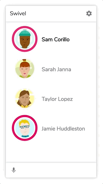
From there it was only natural to begin using these components in a format that seemed familiar: a chat client.
This immediately threw the team into the deep end, as we considered how basic design principles like alignment and proximity might have implications as to the state of user presence. We began exploring positional interactions, as well as audio and video stream presentation in an internal prototype application.
From this, we learned several more things about how users are attached to their own sense of presence. We learned that people always wanted to be notified when someone “came near.” We learned that sometimes you have to slow things down to make sure users get what they expect.
As we iterated on our product, we found that we actually enjoyed its benefits quite handily. We decided to expand the UI to take advantage of larger screens, since we found we used the app on desktop as much as mobile.
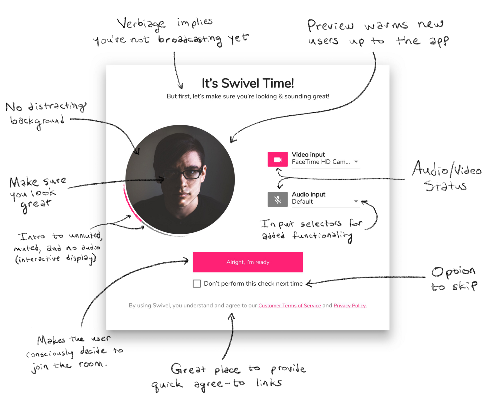
We even found there was a need for a check your hair interface, which allowed the user to be certain of their microphone, camera, and audio states before logging in.
After several months of prototyping, we released a beta version of Swivel. As part of our release process, we arranged a beta introduction presentation at a local coworking space. To test the app, we crafted a group puzzle to be solved using Swivel. As expected, we learned many valuable things and came away with new ideas.
The development of Swivel continues, and I count myself lucky to have spearheaded much of its functional design in early stages. It’s continued evolving since my involement, but do take a look at its current form: Swivel.