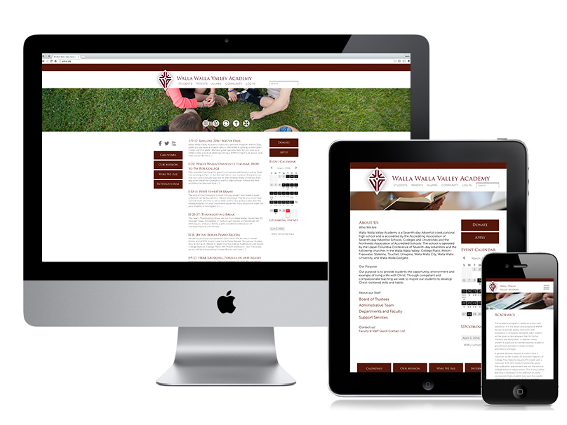
Walla Walla Valley Academy: Custom WordPress Theme

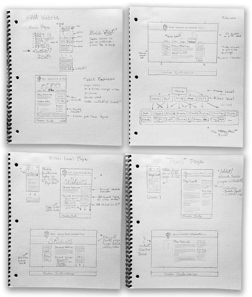
A local highschool recognized that they needed to bring their site into the future. They came to me. Meeting with their head of marketing, I gathered the goals of the site and worked up initial sketches. The sketches explored both site structure and content layout. When I start a project like this, I always like to begin by quantifying the site’s content and its usefulness to the viewer. Once I have a good idea of all the content’s purpose, I can then craft up a solution that makes the right content available in the right context and presentation.

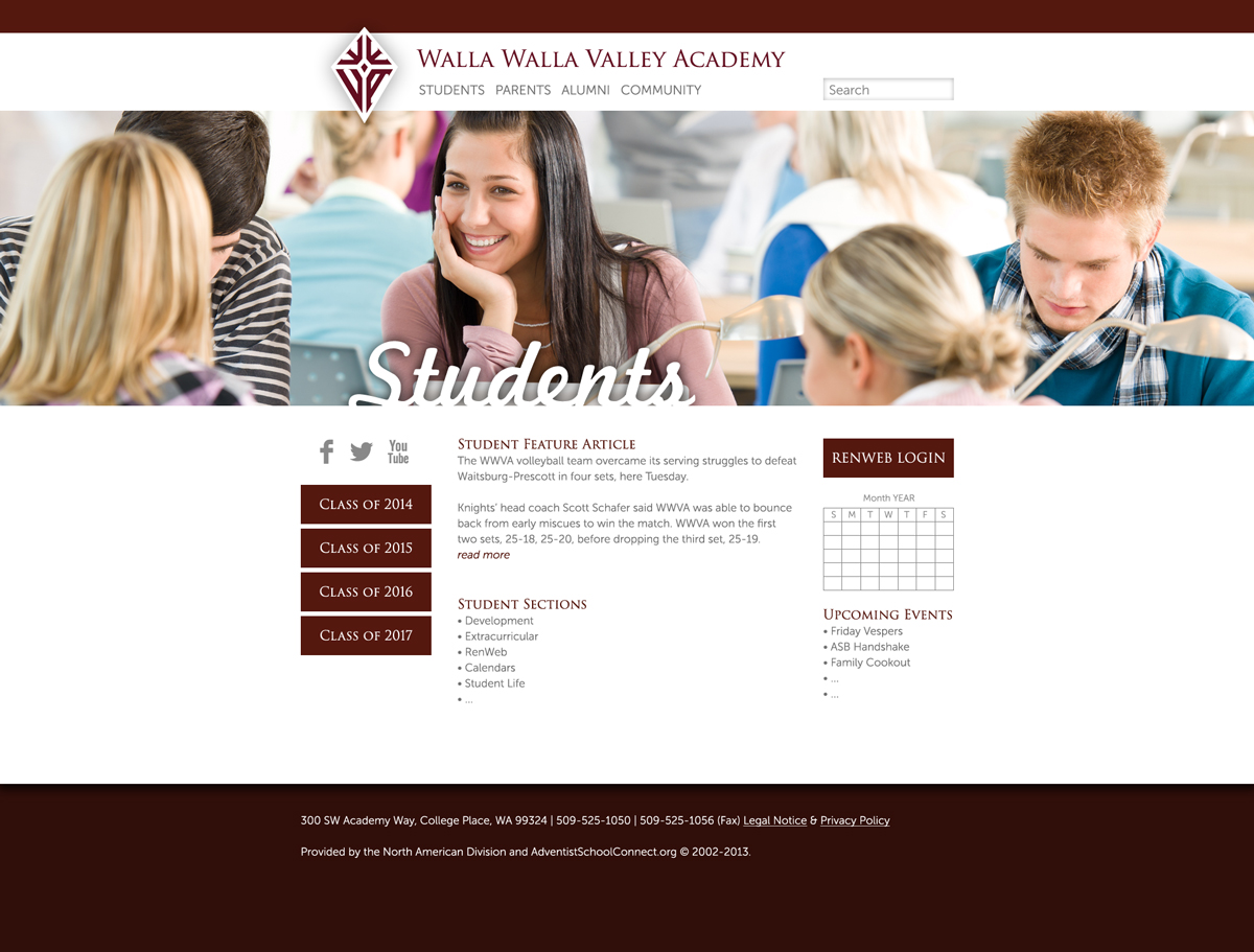
From there, I met with the client for revisions & feedback, then proceeded to create digital mockups of the site layouts. This included making a few as-yet-undigitized assets for the client’s use, such as the site logo.

From there, I coded up the mockups as WordPress page templates. Using a base theme structure, I created global styles and page template layouts, and tested on different devices/browsers. I followed up the site construction with deployment and training sessions to make sure the client felt comfortable managing content. It was a hit! Once the site was deployed, the marketing director asked if I could do a photoshoot to get some school specific images for the headers. An afternoon of photography later, the site was ready to be populated with flavors of the school.


Since then, the site has seen growth and revision as client need shifts over time. The site is available at wwva.org.